It’s weird, to me it has too much and too little going on at the same time: I love the italic Cadillac merging and splitting B/W, but then they mush everything with the gradient and the strange faded logo pattern at the back. I didn’t yet see a top view, though, where the design should give its best. The white wheels are awesome!
White wheel walls are awesome and I think it looks okay from the white side, if a little boring. I don’t like it at all from the black side and it doesn’t really feel like the asymmetry adds anything other than a talking point. I wonder what a mockup of just the white side duplicated would look like.
The chrome bits on the logo towards the rear look great though, if they keep that in it’ll look awesome in direct sunlight.
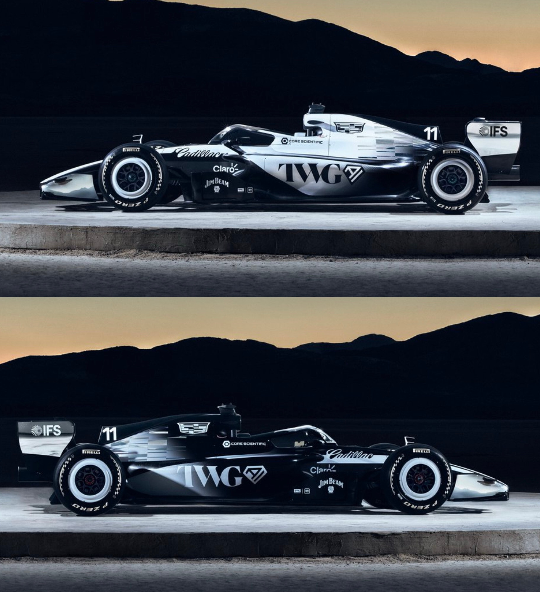